


Hey you, happy Thursday! As you may have noticed, last week we launched a new part of the blog aimed solely at photographers, and we couldn’t be any more excited to be sharing nearly a decades worth of knowledge with you guys. Partly because we find ourselves getting emails from time to time with questions about how we shoot (which we thought more than one person may be wondering), and also because we love helping others grow. It was what drew us to teach all those years ago, and even though the K-12 classrooms weren’t where we were meant to stay, the excitement we get from helping someone have a lightbulb moment (or in this case should we say a flash moment ; ) never went away. So if you’re new here we hope you’ll stick around, and if you’ve been hanging out for a while we’re so glad to see you again!
As photographers it is easy to take the easy road out on a wedding day, with thoughts like “well, this is just what this looked like” or “it isn’t my fault the hotel didn’t light this space well”. And if you’re someone who has driven your car down the Easy Road off-ramp WE GET YOU. Because a lot of times, it is easier to settle into that idea than to come up with something new. To come up with something BETTER. Wedding days are busy and chaotic and stressful, and maybe you feel like you can’t add another chainsaw to the mix when you’re already juggling those first 15 (“You want me to do WHAT?! I’m already trying to light reception candles and move ugly salad dressing boats and evacuate 15 people from this room all while standing atop a broken folding chair to get these room shots in 3 minutes before the guests come in!”) We’ve been there.
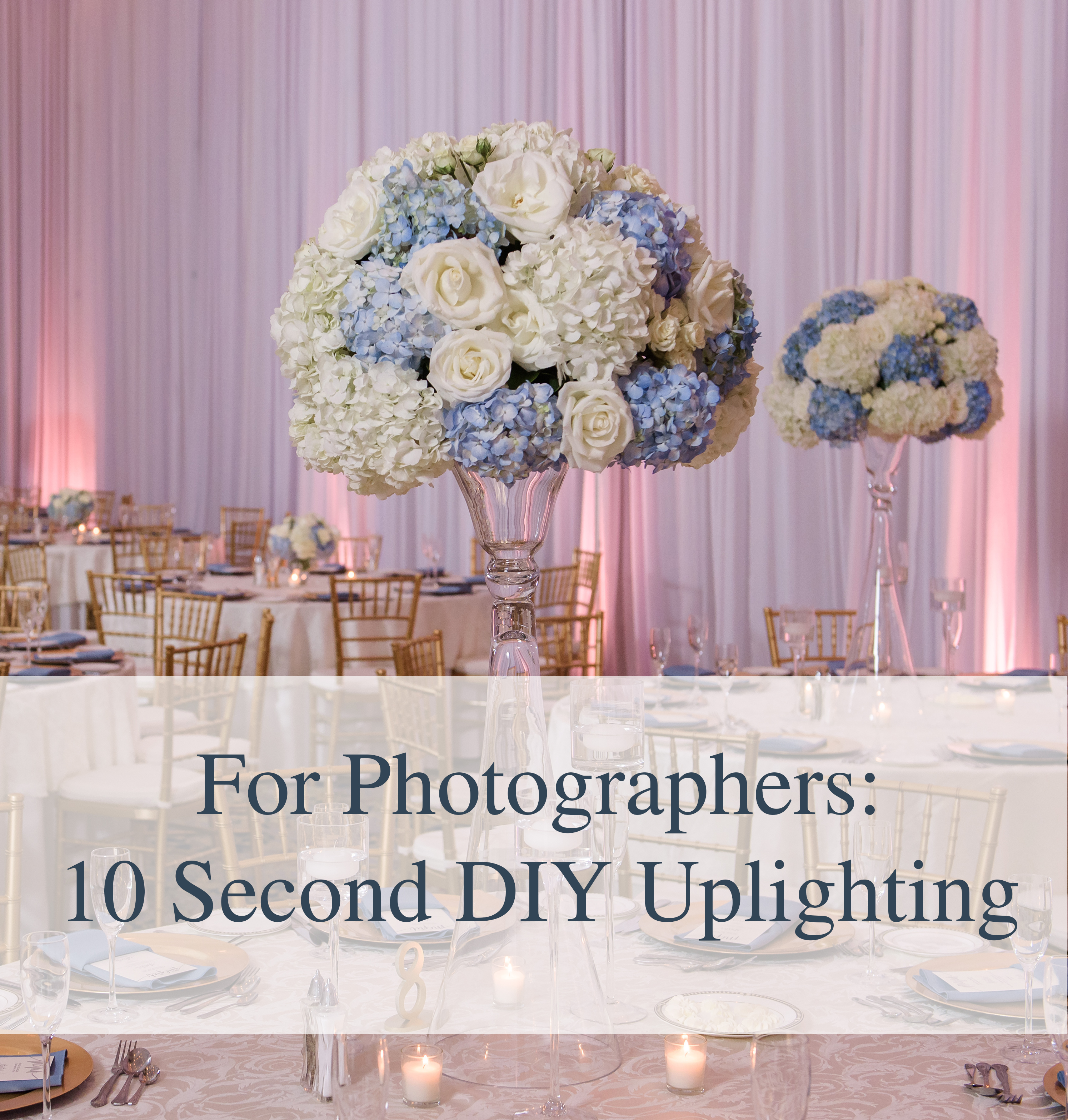
But today we’re talking about an insanely quick and easy way to add visual interest to images, that will literally take you ten seconds to implement. (REALLY. We timed it.) Today, we’re talking DIY uplighting.
It’s happened to all of us. You walk into a beautifully decorated reception space with stunningly elaborate florals, monogrammed menus, uplighting, the perfect chairs, and yes, you can’t believe your eyes, but there is even a basket of puppies wearing flower crowns in the corner as favors
(ok, that last one may be a stretch, but would that not be AMAZING?!)  But then you spot the cake in the corner, of the room, which the hotel has decided to put in a less than flattering location in less than flattering light, in a spot with absolutely no visual interest sitting up against a plain ol’ wall.
So how are you going to create an image that matches the rest of the room’s upscale vibe?
You would normally just move it, but this cake is ginormous and you haven’t been to the gym in days weeks months.
So you just shoot it as it is.

And you think, this picture is totally FINE.
It is exactly what the cake looked like in the location it was placed. All of the details are there and the colors are true to what they were, and we’ve even got a little of that directional lighting going on that we’re always looking for when we use off camera flash. (We see you highlights and shadows!) But is it doing anything for us visually?
If this picture was a word, we’re pretty sure it would only need 3 letters.
MEH.
So what if you could invest just a tiny bit of time to get a big result, and create an image that elevates the first image to one that more accurately depicted the elegance and high-end vibe of the day?

By popping in a kicker light (just a regular flash on a foot) you can add a quick pop to give the effect of uplighting behind the cake. Not only does it give the cake some separation from the wall it is placed on, but it creates an overall more dynamic image that matches the rest of the decor mucho better!

See?
In order to accomplish this, we turned our flash to manual mode, and then used the following settings:
Flash Head at 45 degrees pointed towards the wall
Zoom: 120 mm (to create a narrow beam of light)
Power: 1/128
A quick note: depending on the distance between your cake (or whatever you are trying to add light behind) and the wall, the zoom/power settings may need to be changed. For this specific example the cake table was right up against a wall, which meant we didn’t need as much power to reach it, and needed a narrower beam (affected by the zoom) so that it wouldn’t light up the entire wall and make it look flat.
Double Bonus Note: In this case we were trying to match decor with a very neutral palette, so we kept our flash bare. But if you wanted to give the light some color you could totally pop on a gel or filter to change the look.

The result is a much more rockin’ image that far better matches the day, and you get to feel like the bomb dot com for making it happen fast.
(Which means you should obviously get to have ice cream on the way home).
Hope this helps, and as always we’d love to hear from you! If you have any questions about this post, or any new ones you’d love for us to write about in the future leave us a comment or send us an email at hello@sarahben.com!
Love + Laughs,
Sarah & Ben


Thanks for the great tip!
Thanks Willy! Hope it is helpful to you!
Love this tip guys!! Great job, keep it up!
Thanks for following along! <3